NORTHFIELD MOUNT HERMAN

Nearly 200 years of history is either a burden or a foundation. The school’s own language said it best: education for the head, heart, and hand. The work was finding what had always been true and making it mean something to a fifteen-year-old without losing the alumni who lived it.

BRAND STRATEGY + CREATIVE DIRECTION + BRAND IDENTITY + ART DIRECTION + DESIGN

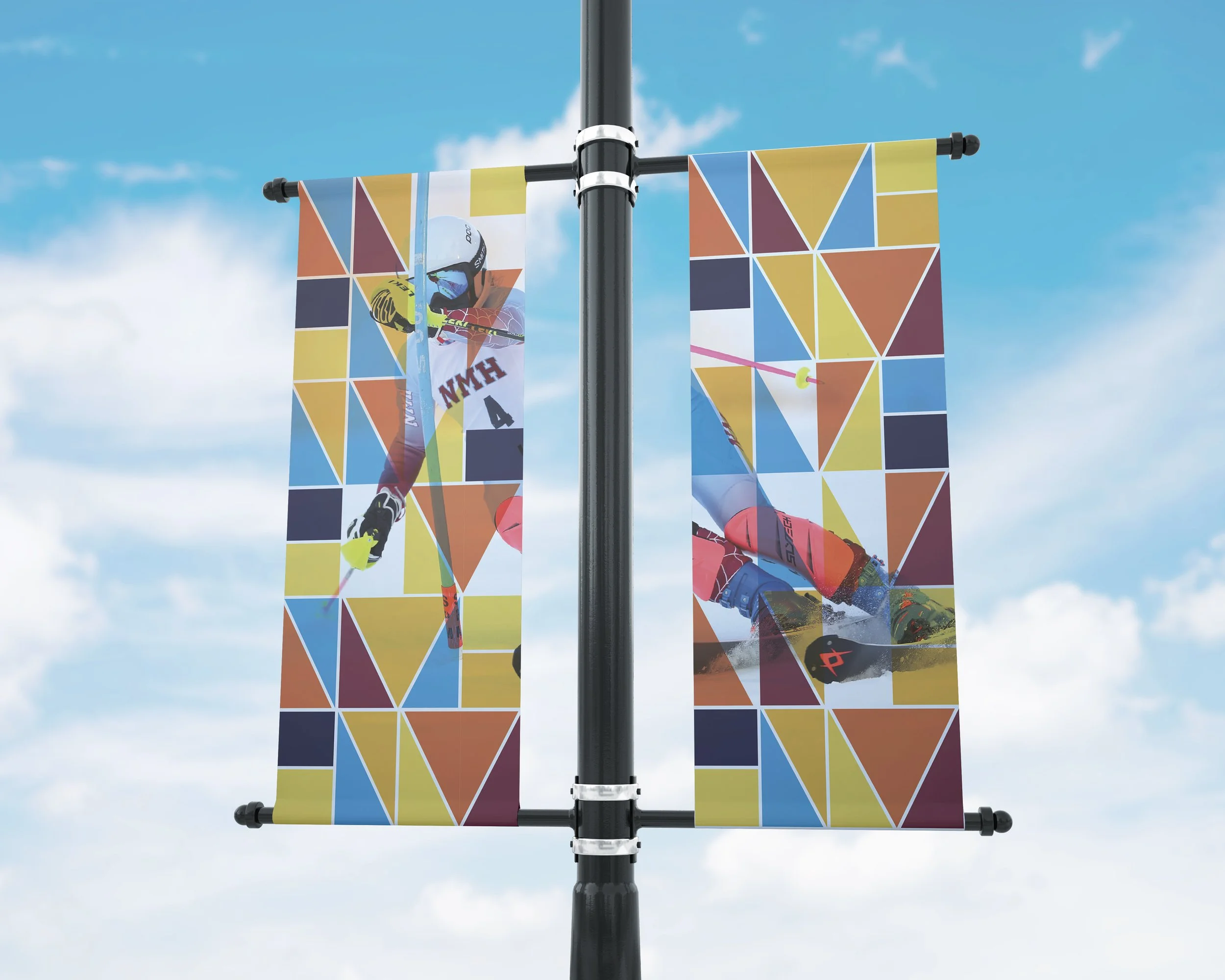
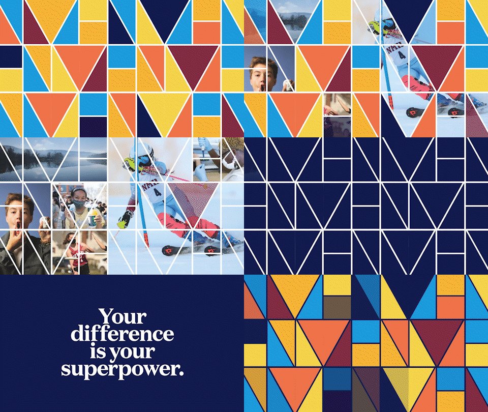
Northfield Mount Hermon didn’t need to abandon its history to become relevant to a new generation. We found the foundation for the new identity in the school’s own archive—a modernist NMH mark from the 1970s—and brought it forward. The identity became a flexible visual system that could reflect the individuality of today’s students while still belonging unmistakably to NMH.
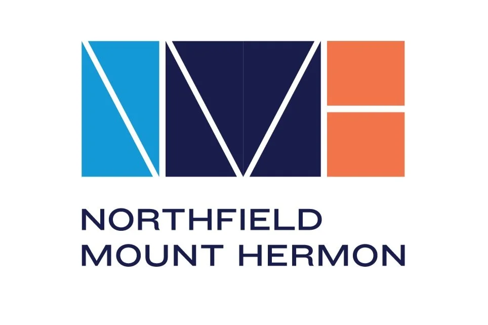
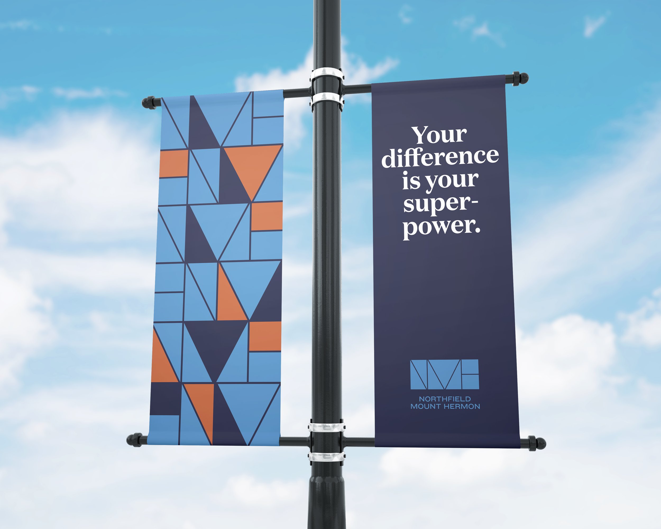
Northfield Mount Hermon logo and refreshed brand identity.
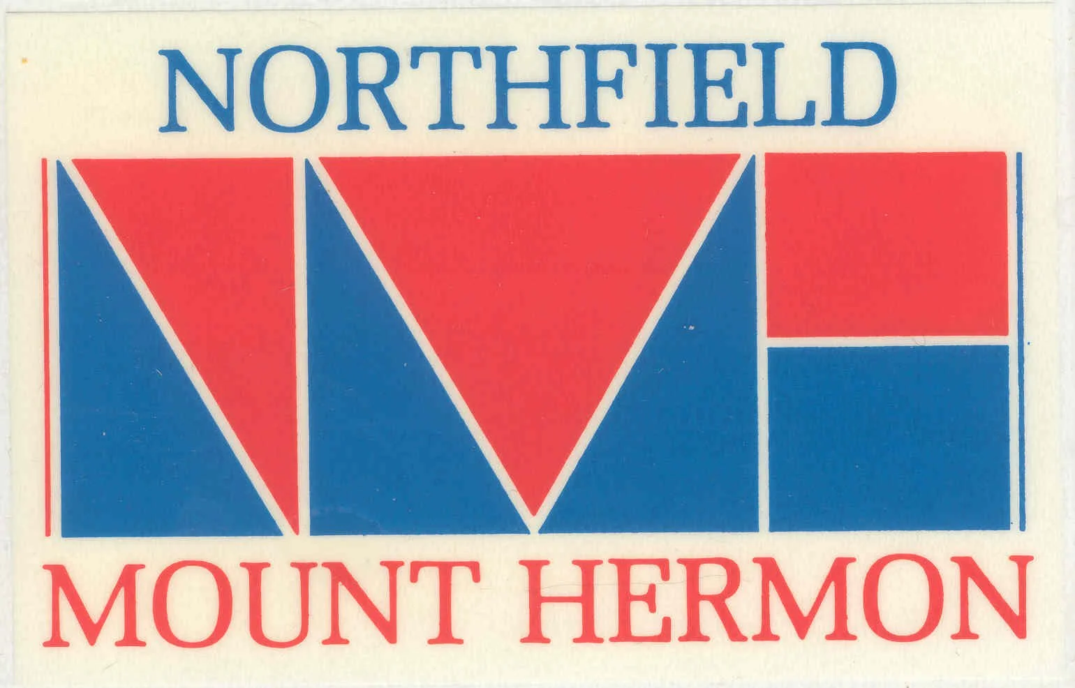
Original Northfield Mount Hermon logo from the 1970s that inspired the refreshed identity.

The Original Logo

Discovered in the archive, this logo from the 70’s was used as the foundation for the new brand identity.
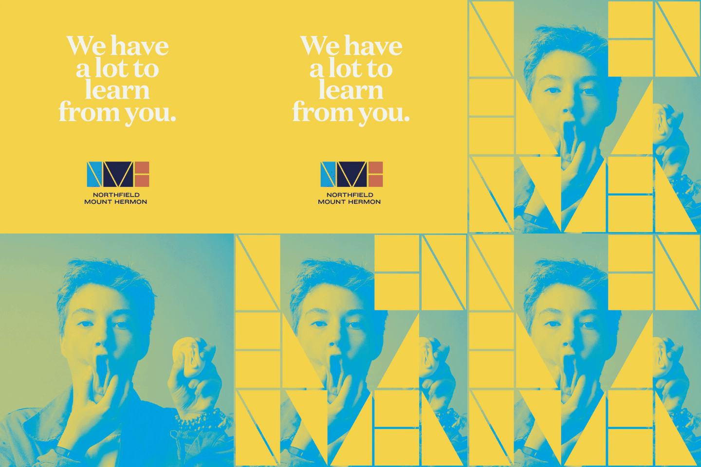

Northfield Mount Hermon student photography integrated with the geometric brand identity.
Northfield Mount Hermon campus banners featuring the colorful geometric visual identity.
Northfield Mount Hermon flexible visual identity system combining student photography and geometric forms.
Northfield Mount Hermon website design extending the refreshed brand identity.
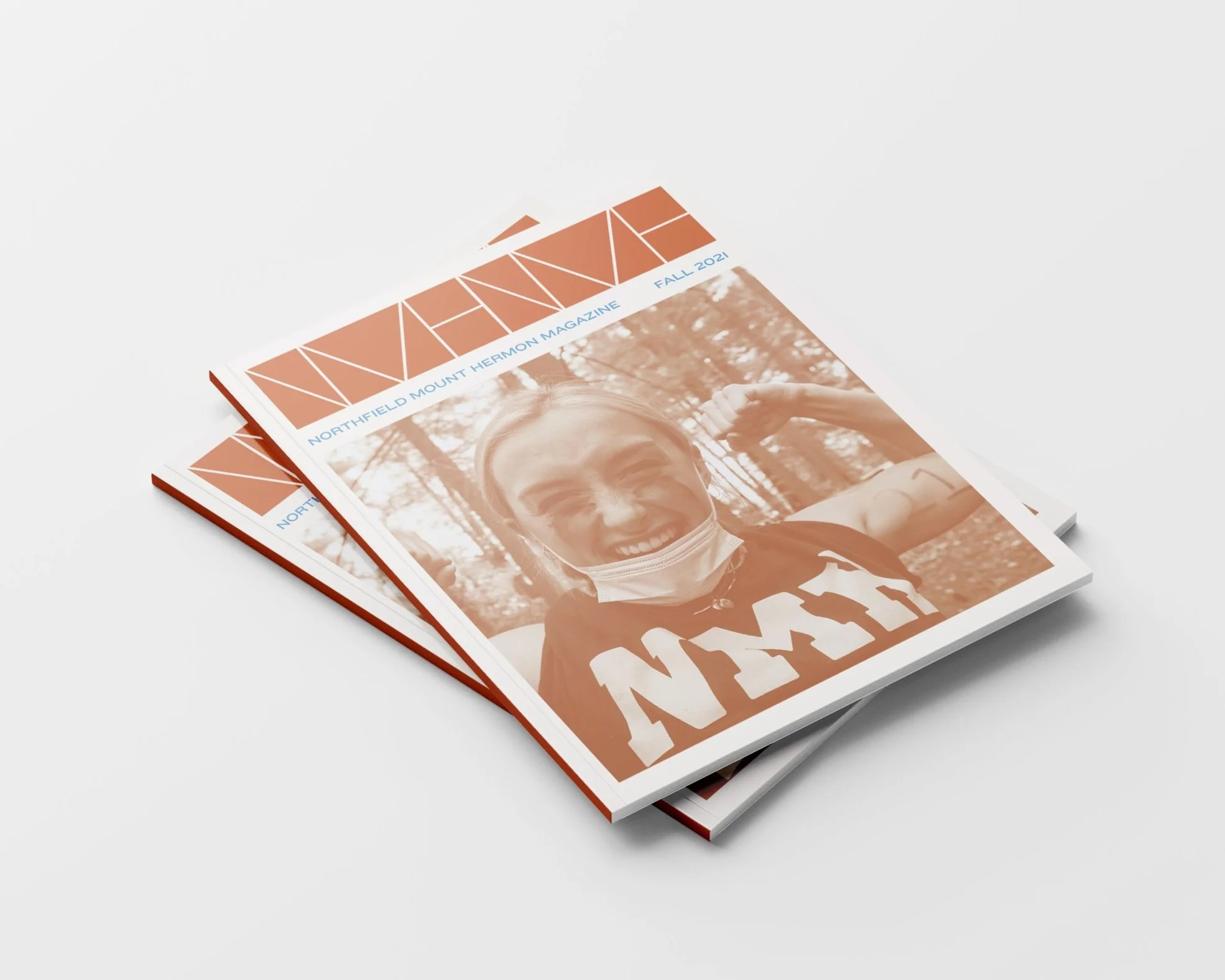
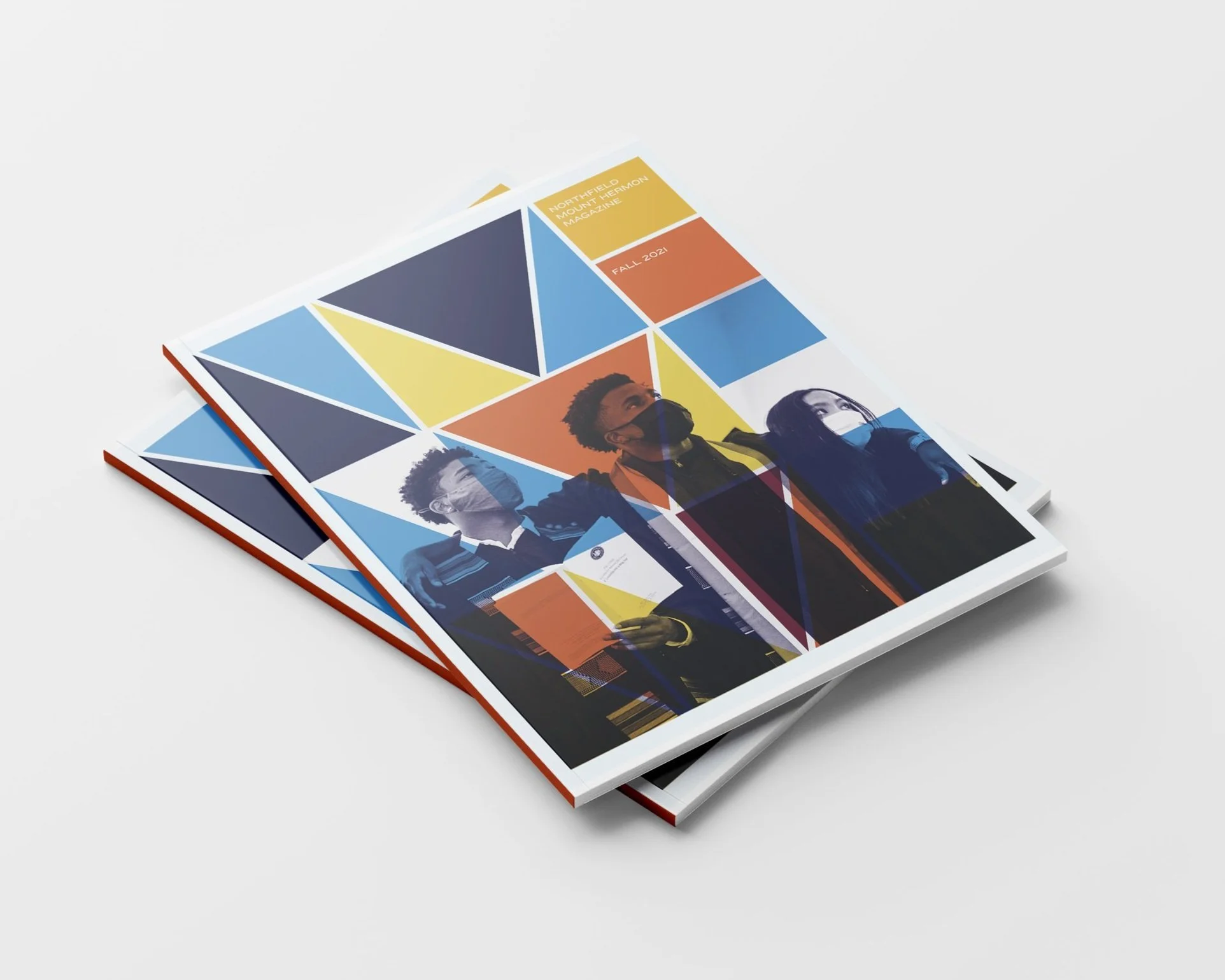
Northfield Mount Hermon publication design featuring student photography and the refreshed identity.
Northfield Mount Hermon viewbook design using the school’s geometric visual identity.