THE BETTERING CO.

Cannabis edibles were treated as an afterthought. Bad taste and inconsistent dosing were simply part of the experience. Customers put up with it because there wasn't much of an alternative.

BRAND DEVELOPMENT + NAMING + CREATIVE DIRECTION + PACKAGING + ART DIRECTION + DESIGN

The Bettering Company believed cannabis edibles could be carefully made, precisely dosed, and genuinely more enjoyable. We built the brand around that idea. The discipline of a confectioner, applied to cannabis. Everything—from the name to the packaging—was designed to make that difference visible.
Awwwards.com Site of the Day 7.65/10

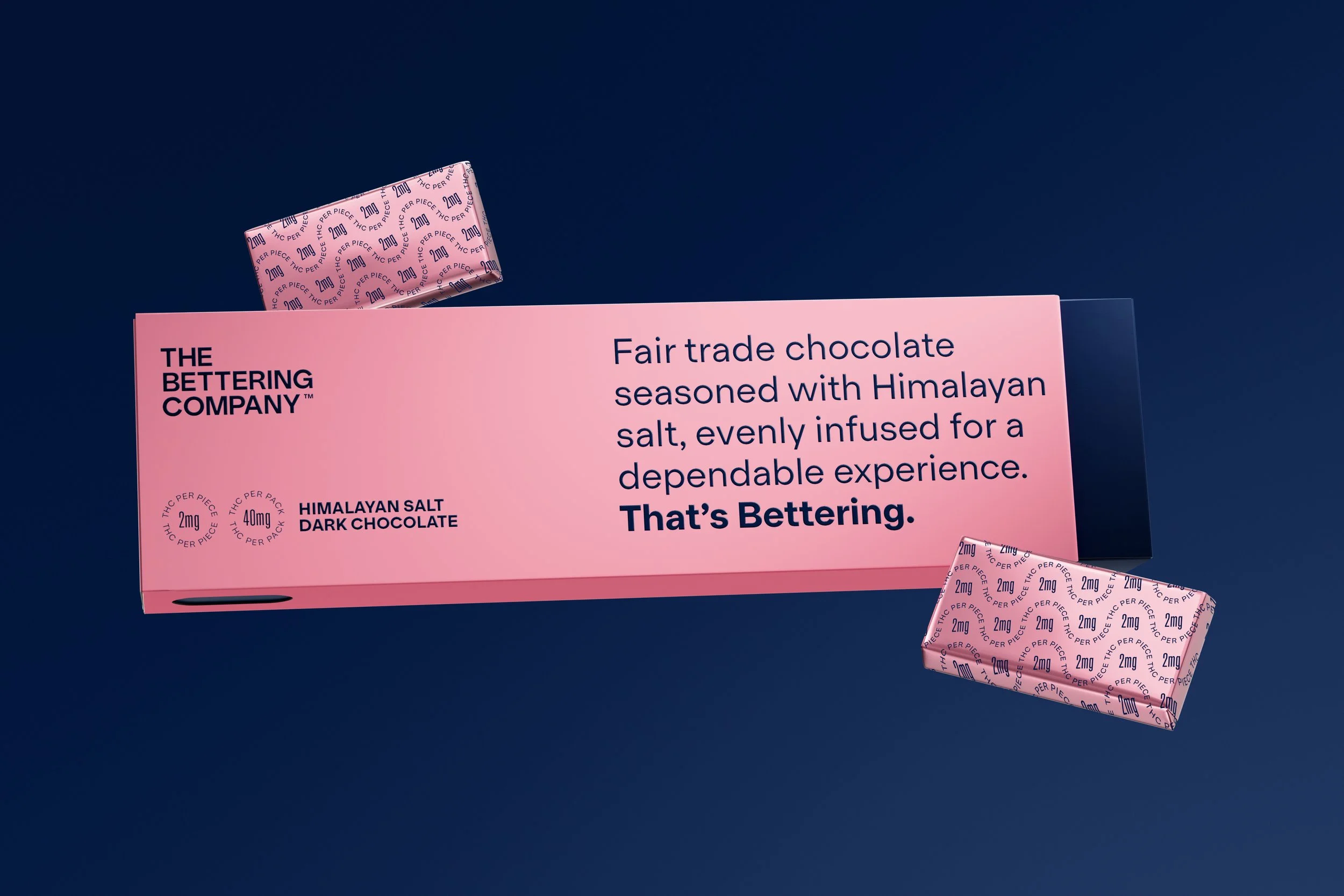
The Bettering Company cannabis chocolate packaging featuring the brand’s precise, minimal visual identity.
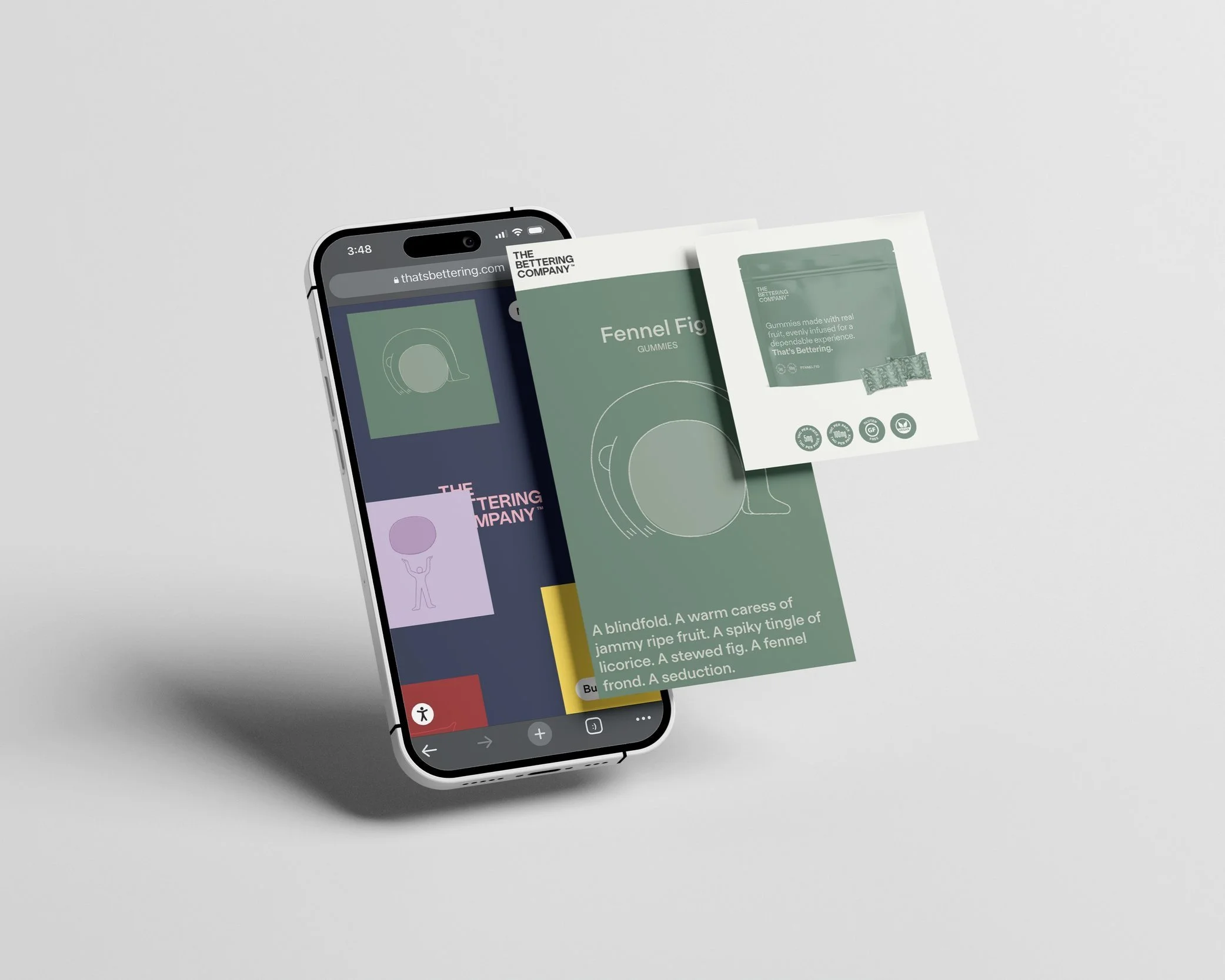
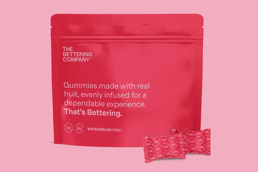
The Bettering Company cannabis gummies packaging featuring the colorful product identity system.
The Bettering Company website design extending the cannabis brand identity into a digital experience.
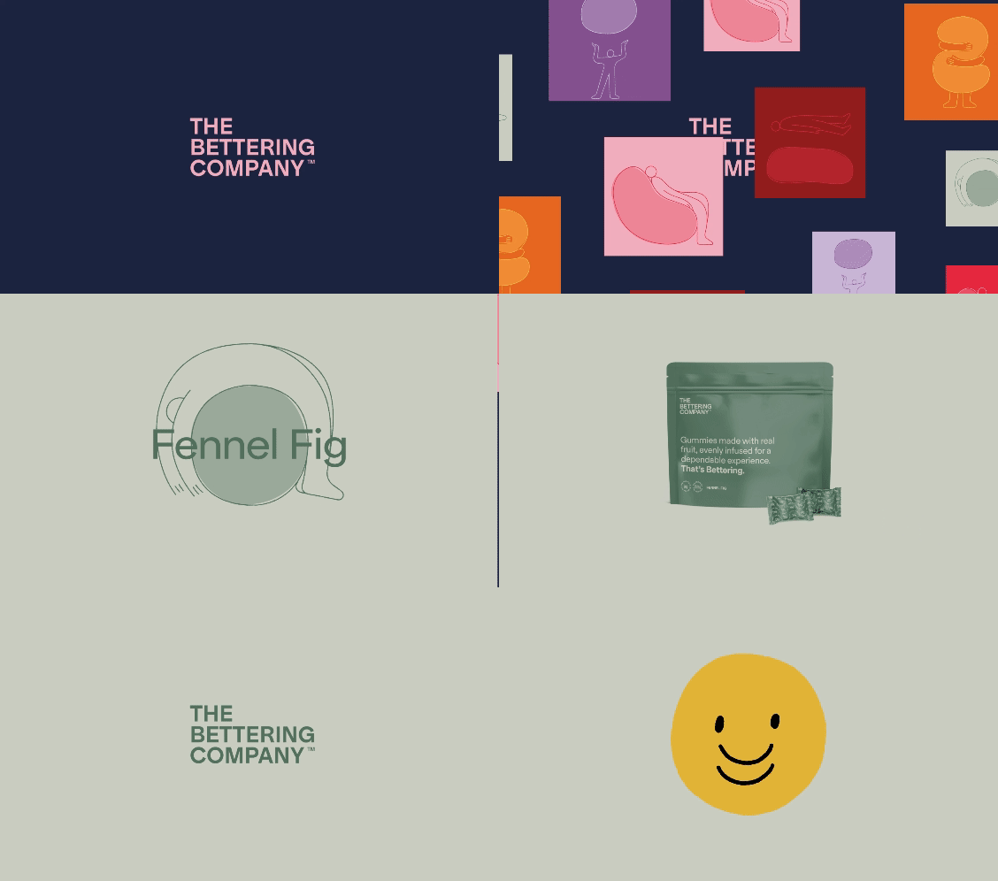
The Bettering Company brand identity featuring the logo, typography and visual system.
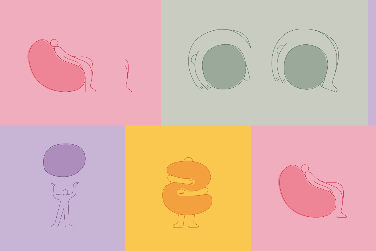
The Bettering Company custom brand illustration created for the cannabis edibles identity.
The Bettering Company custom brand illustration and animation created for the cannabis edibles identity.

Graphic Design: Richy Lamb

Web Design & Development: Basilico

Illustration & Animation: Lourenço Providência